Colour yourself calm
OPULENCE • The Journal • Feb 19
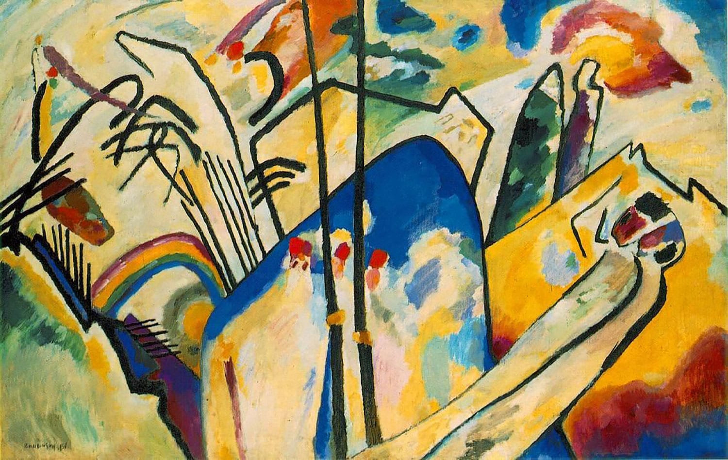
‘Colour is a power which directly influences the soul,’ said the artist, Wassily Kandinsky. As the first abstract painter, he was also one of the first artists who expressed how different colours affected human emotions, a core principle of modern art. His colour theory was published in 1911 and explained the effect of colours in two ways: the effect on the eye (a person’s physical understanding of the colour) and the ‘inner resonance’ or psychological and spiritual experience provoked by looking at a colour.
Kandinsky attributed emotions and states for each colour that he believed could be transmitted through paintings. He suggested, for example that yellow was warm, cheeky and exciting; that green brought about a state of peace and stillness; blue was a typically heavenly colour, peaceful and even supernatural. He went on to clarify that the lighter the blue, the more calming it is. When in the end it becomes white, it reaches a state of absolute calm, with the quality of ‘a harmony of silence’.
Though radical in his time, it appears that the power of colour to affect human health and wellbeing goes much further back than Kandinsky. In Ancient Egypt sunlight was focused through coloured glass on specific areas of the body to promote healing. Ancient Sanskrit healers used an energy system of chakras, points in the body that react to specific colours. Colour was also vital to medicine, in the doctrine of the four humours, throughout Europe from the ancient Greeks and Romans to the Renaissance.
These days colour therapists (or chromatherapists) still believe that different colours in the spectrum correspond with the body’s inner vibrations. If your vibrations are off-kilter, therapists believe that colour can harmonise and rebalance them if treated with the right colours.
More recently research suggests that as well as affecting our emotional state, our memories too may be affected by colour. It appears that we are significantly better at recalling scenes, pictures and images if they are not just black and white. Natural colour is what the human brain expects from its view of the everyday world – and anything different fails to make an equivalent impact. Colour pictures in natural colours, are more ‘richly’ represented in memory.
Dr Karl Gegenfurtner, co-author of the research, said: ‘it appears as if our memory system is tuned, presumably by evolution and/or during development, to the colour structure found in the world. If stimuli are too strange, the system simply doesn’t engage as well, or deems them unimportant.’
Perhaps that explains why we have no problem recalling the startling blue of the sea on our Caribbean holiday or the fields of sunflowers in the South of France?
Ever mindful of our changing desires when we travel, and as passionate as always about bringing colour into our travelling lives, now STOW reveals a new set of colour combinations in some of their existing ranges. STOW’s new colours reflect our deep desire to reconnect with those natural colours of the world.
The new colour combinations of coral and blue, green and pink and yellow and chalk, are drawn from dramatic scenery, big adventures and nature.
The new colours speak of a care for the environment, a cherishing of what nature provides and of the experiences that can only come from crossing boundaries, climbing mountains and travelling across continents. They are all colours intimately connected with our earth.
STOW’s newest colours might summon memories of clear blue oceans thronging with pale-coloured coral; lush rainforest bursting with exotic pink flowers or mountains tops daubed with morning sun. Wherever you travel this year, take a bit of calm or warmth or peace with you with STOW’s new colours.

